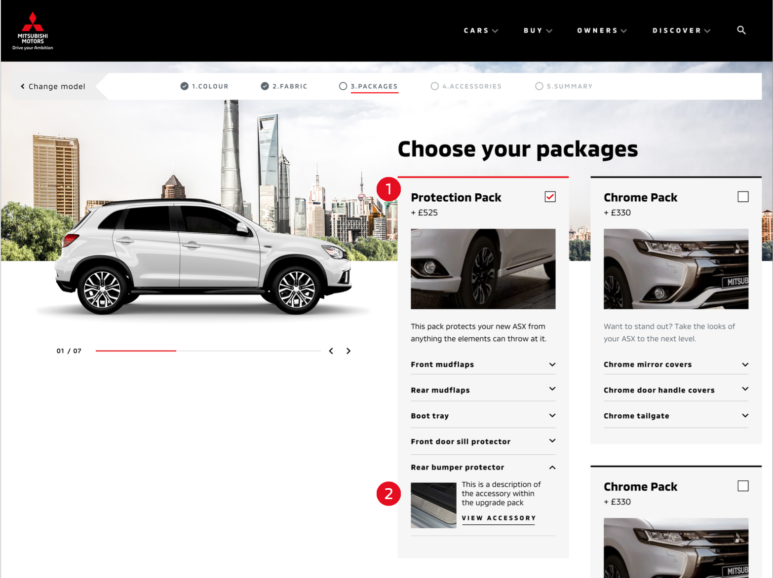
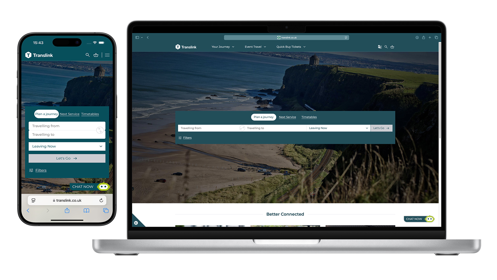
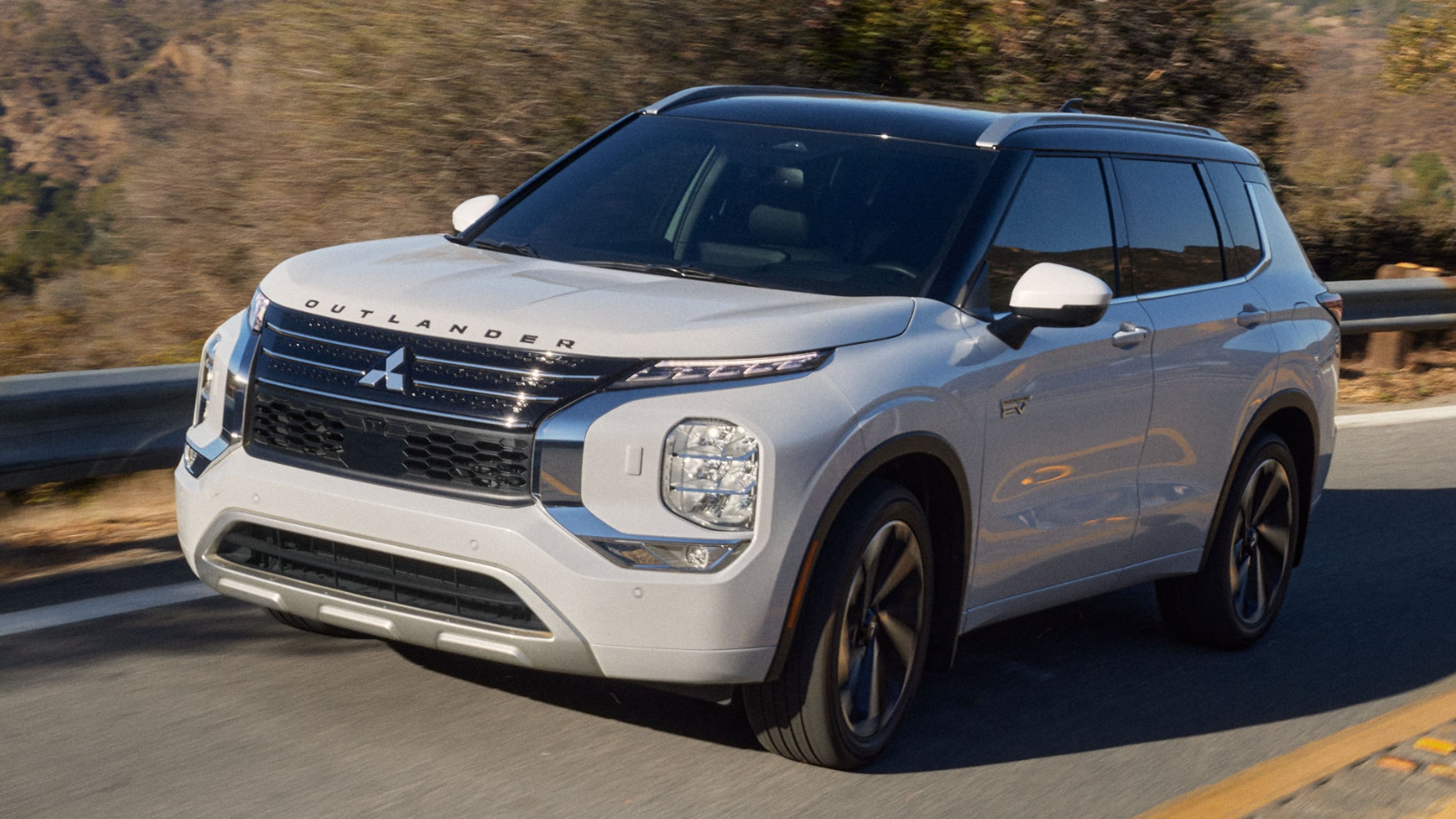
Mitsubishi Motors UK – Website Redesign
Reimagining a digital showroom that captures clarity, emotion, and the essence of every vehicle.
Project Overview
As Principal UX Designer, I led the end-to-end redesign of the Mitsubishi Motors UK website, reimagining how customers discover, explore, and connect with the brand online. The goal was to craft a modern, intuitive, and emotionally resonant digital experience that reflects Mitsubishi’s evolving identity — one that inspires confidence, drives engagement, and seamlessly supports vehicle enquiries, test drives, and sales conversions.
Working closely with developers and UI designers, I focused on translating Mitsubishi’s brand heritage and innovation into a cohesive digital journey, ensuring every interaction felt purposeful, elegant, and effortless across devices.
Project Context Snapshot
Company:
Agency side Critical Mass — client Mitsubishi
Duration:
3 Months
Tools:
Sketch
Team:
Collaborated with UI Designers, Developers, and Digital Marketing stakeholders in an agile workflow. As Principal UX Designer, I led the experience strategy, interaction model, and design documentation.
Objective:
To redesign the Mitsubishi Motors website into a modern, emotionally engaging, and conversion-driven digital experience, increasing test drive bookings, vehicle configurations, and brand alignment across the UK market.
The Challenge
The previous Mitsubishi Motors UK website struggled to deliver a coherent or inspiring brand experience. Navigation was fragmented, the brand story diluted, and users found it difficult to find key information or book a test drive.
Through a competitive audit of Honda, Renault, and Volvo, I identified common UX pitfalls; illegible typography, unclear navigation, and uninspiring CTAs. These findings revealed a broader opportunity: to design a simpler, emotionally resonant online journey that helped users move seamlessly from curiosity to conversion.
Success was defined not only by improved performance metrics; such as increased test drive bookings and car configurations, but by creating a refined, brand-led experience that restored clarity and confidence across every touchpoint.
Research & Insights
Our research revealed a clear truth: potential buyers weren’t just looking for specifications — they wanted to feel connected to the car before ever stepping into a showroom. The digital experience needed to capture the essence of driving a Mitsubishi; the textures, details, and presence that define each model.
Visual benchmarking across leading automotive brands highlighted a missed opportunity. Many sites focused on technical comparison or high-level storytelling, but few truly brought the car to life online. This inspired a more immersive approach: showcasing vehicles through bold imagery, dynamic range views, and interactive elements that mirrored the in-person experience of discovery.
User feedback and analytics reinforced the direction; people wanted to see what the cars came with, understand how they looked and felt, and move effortlessly through the journey from curiosity to enquiry. The insight was simple yet powerful: the more we helped users emotionally experience the car online, the closer they moved to booking a test drive.
Visual Benchmarking Insights
To better understand how leading automotive brands translated their identity online, I conducted a comparative homepage analysis of Honda, Renault, and Volvo. While each reflected its brand heritage, common usability and visual gaps emerged — insights that directly shaped Mitsubishi’s redesign strategy.
| Brand | Strengths | Gaps Identified | Key Takeaways for Mitsubishi |
|---|---|---|---|
| Honda | Strong brand visibility and dynamic video hero | Overwhelming scale and poor legibility of text | Use immersive imagery purposefully — balance emotion with clarity |
| Renault | Clean layout with clear CTAs | Small, hard-to-read typography and weak hierarchy | Prioritize legibility and a clear navigational structure |
| Volvo | Elegant lifestyle imagery with inclusive tone | Dense car grid, unclear differentiation between models | Simplify product discovery and create visual breathing space |
From these comparisons, I identified three design principles to guide the Mitsubishi redesign:
- 01. Elevate Emotion — Use large, cinematic imagery to make cars feel aspirational yet accessible.
- 02. Clarify Navigation — Reduce complexity, letting users intuitively explore models and features.
- 03. Design for Discovery — Encourage engagement through clear CTAs, subtle motion, and layered storytelling.
These insights laid the groundwork for a digital experience where every interaction reflects the feeling of standing beside a new Mitsubishi — confident, modern, and full of motion.
.Design Approach
Guided by the goal of bringing Mitsubishi’s vehicles to life online, the design process focused on crafting immersive, intuitive journeys that allowed users to explore each model as if they were standing beside it. Every interaction was designed to feel deliberate, a balance between emotion and precision, between visual storytelling and functional clarity.
Using insights from the competitive analysis, I established three experience pillars: Clarity, Immersion, and Flow.These principles shaped both the structure and motion of the redesigned site.
- Clarity: Simplified navigation, with a clean, always-visible sort function on desktop and an accordion-based filter on mobile, ensuring users could find their ideal car without confusion.
- Immersion: Rich, full-width imagery and cinematic transitions gave each vehicle a sense of presence. Cars “drove in” from the edges of the viewport, creating a subtle moment of motion that echoed the brand’s spirit of performance.
- Flow: The “Help Me Choose” and Configurator experiences were redesigned as smooth, guided journeys, from model selection and preferences to colours, fabrics, and accessories. A step tracker and sticky summary bar helped users stay oriented, while contextual CTAs encouraged exploration without breaking the flow.
Every design decision, from contrast states on filters to the dynamic update of pricing and visuals, reinforced a seamless sense of control and craftsmanship; transforming a previously static browsing experience into an engaging digital showroom.
Visual & Interaction Design
The visual design was guided by a simple belief: every pixel should express the car’s character. From colour palette to motion, the goal was to translate Mitsubishi’s energy and craftsmanship into a digital form that felt bold, confident, and tactile.
Large, cinematic imagery anchored the experience — vehicles appeared with smooth transitions, creating a sense of arrival rather than load. CTAs and balanced whitespace enhanced usability while softening the aesthetic, allowing the cars to take visual precedence.
Typography and interface elements were refined for legibility and tone — clean, high-contrast layouts ensured that navigation felt intuitive while evoking the calm precision of premium design. Subtle motion cues, like the “drive-in” animation of cars and progressive disclosure in the configurator, added rhythm and flow to each journey.
The result was a visual system that didn’t just show Mitsubishi’s vehicles — it let users feel their presence, creating a digital experience that elevated the brand’s modern identity and inspired exploration.
Testing & Iteration
While this project focused primarily on the redesign and modernisation of Mitsubishi’s digital experience, validation was embedded throughout the design process. Each flow, from the Configurator to Brochure Download and Test Drive Booking, was prototyped and reviewed iteratively with internal stakeholders, developers, and the wider digital team to ensure that every step felt natural and consistent.
Rather than formal user testing, we focused on design logic and flow validation:
- Ensuring that users could move effortlessly between related journeys; exploring, configuring, enquiring — without cognitive friction.
- Confirming that elements like sticky navigation, step trackers, and confirmation summaries consistently reinforced clarity and confidence.
- Reviewing interactive prototypes to validate that motion, transitions, and visual hierarchy made sense and guided attention intuitively.
Each small refinement, from button states and field behaviour to the emotional pacing of imagery and content, contributed to an experience that felt intuitive, connected, and grounded in real-world expectations.
Impact
The redesigned Mitsubishi Motors UK website delivered a clearer, more emotionally resonant user experience, transforming a once fragmented platform into a cohesive digital ecosystem. By harmonizing visual storytelling, intuitive navigation, and consistent interaction patterns, the new experience gave users a more natural and inspiring way to connect with the brand.
While full post-launch analytics were handled internally, early indicators and stakeholder feedback showed meaningful improvements:
- Increased test drive bookings and brochure downloads, reflecting smoother conversion flows
- Higher engagement across car configuration journeys, with users spending more time exploring individual models and options.
- Stronger brand consistency across pages and devices, aligning Mitsubishi’s UK presence with its global standards.
- Positive feedback from internal teams and dealerships, who noted clearer customer journeys and reduced friction in lead generation.
Beyond metrics, the most significant impact was emotional — users could finally see, feel, and explore Mitsubishi’s cars online in a way that mirrored the physical experience of discovery. The redesign established a foundation for ongoing innovation, where design clarity and brand storytelling work together to inspire confidence and connection.
Reflection
This project reinforced the importance of designing for emotion as much as function. With a visually led experience, every decision needed to balance information with inspiration, revealing just enough detail to inform, without overwhelming the user or diluting the brand story.
It was about capturing the essence of each vehicle, its form, character, and purpose, and exposing the right information at the right moment in the journey. Too much specification risked turning the experience into data; too little, and the connection was lost. Finding that balance became an exercise in restraint and timing; in knowing when to show and when to let the user feel.
As Principal UX Designer, this project deepened my appreciation for how flow, narrative, and visual craft come together to shape brand emotion in the digital space. The outcome wasn’t just a more usable site, but a more human and memorable experience — one that truly let Mitsubishi’s cars come alive online.