3 mobile app

App prototype to production

Illustration showing a grid of nearly identical app UIs to emphasise sameness
App Store Rating 4.4★ Secured Stakeholder Funding Sketch → Figma Migration Principal UX/UI Designer 4-Week Delivery Sprint

Project Overview

I set out to design a high-fidelity prototype for a new mobile app, with the goal of securing stakeholder funding for full development and launch on both app stores. As the sole and principal UX/UI designer, I led the end-to-end design process; from concept to interactive prototype; crafting an experience that clearly demonstrated the app’s potential. The result was a compelling, investor-ready prototype that effectively showcased usability, visual polish, and product vision across Android and iOS.

Project Context Snapshot

Company:

Allocated internally at Three HQ, representing an external design agency.

Duration:

4 weeks.

Tools:

Transitioned from Sketch to Figma as part of a wider design modernisation initiative.

Team:

Myself as Principal UX/UI Designer, working alongside a Product Manager and Product Owner from Three, two in-house UX Designers, one PM from my agency, and multiple stakeholders across departments.

Objective:

Deliver a high-fidelity mobile prototype that not only demonstrated the product vision but also proved the agency’s capability and validated the switch to Figma as the primary design tool.

The Challenge

With just four weeks to deliver a high-fidelity mobile prototype, I faced both tight deadlines and internal skepticism. While the internal design team was eager to move from Sketch to Figma, the migration required rebuilding components from scratch, adding significant workload to an already demanding schedule. As the sole designer, I needed to gain stakeholder trust — many were cautious about relying on an external agency; while maintaining transparency and momentum through weekly progress updates, all without getting drawn into internal politics.

Research & Insights

Although the project was primarily design-led, I grounded my early design decisions in data and evidence. Internal reports showed a sharp decline in the app’s performance following the migration to the 3Vision platform — App Store ratings fell from 4.4 to 1.3, and over 90% of reviews turned negative, citing issues like login failures, poor navigation, and a “web view wrapped in an app” experience.

To understand the root causes, I conducted a page-by-page UX audit of the existing app. This revealed multiple broken interactions, duplicated flows, and unclear hierarchies — for example, inconsistent “pay now” journeys and non-functional CTAs across billing and account management screens.

Together, the quantitative data and qualitative audit made it clear that the problem wasn’t cosmetic. The experience needed a complete structural and experiential redesign, with native functionality, simplified flows, and a consistent design system to rebuild both usability and stakeholder confidence.

Design Approach

The project began with a comprehensive audit of the existing app, identifying opportunities to streamline flows and address major usability issues. Initially, the goal was to refine what already existed, but it quickly became clear that a deeper, experience-led redesign was necessary.

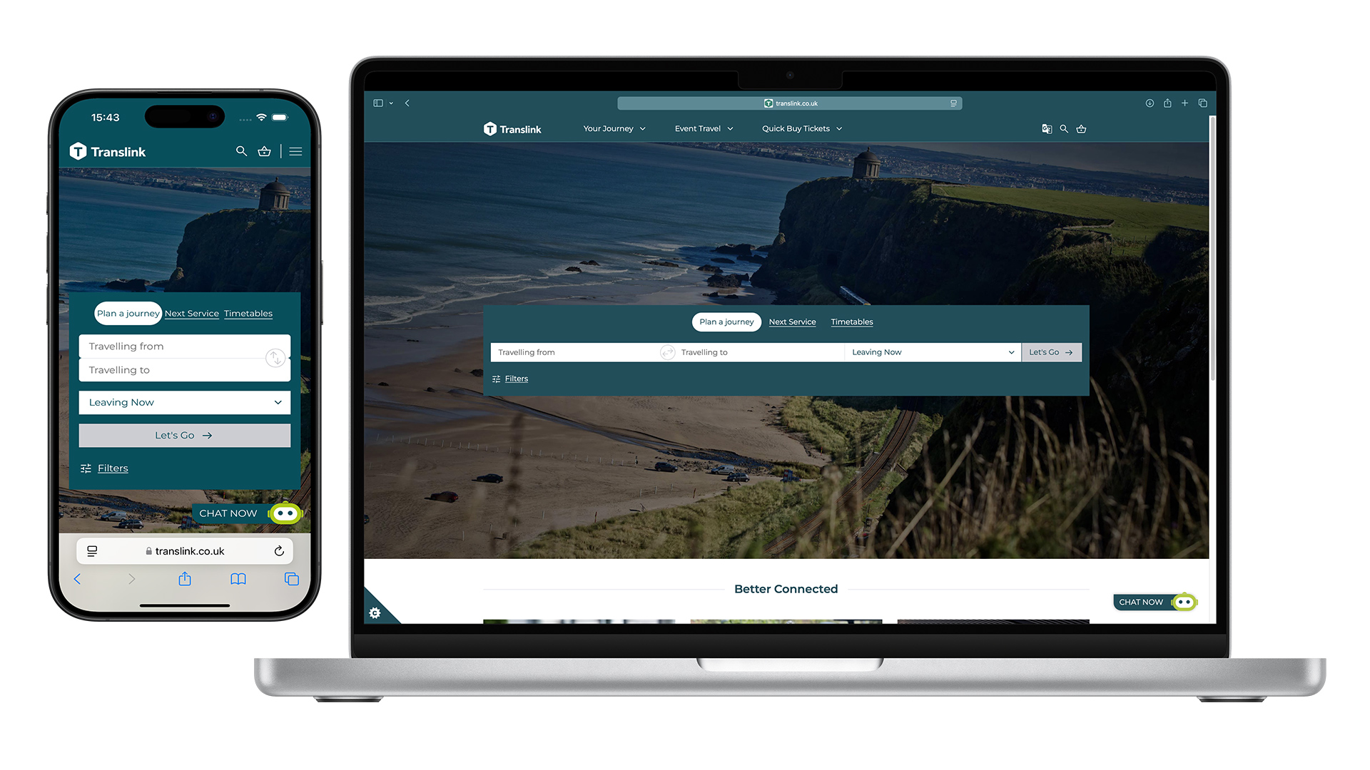
Working closely with the internal team, I migrated brand components from Sketch to Figma, rebuilding the entire design system to ensure flexibility and consistency for future development. This shift not only modernised the toolset but also demonstrated the potential of Figma as a collaborative environment for rapid prototyping and iteration.

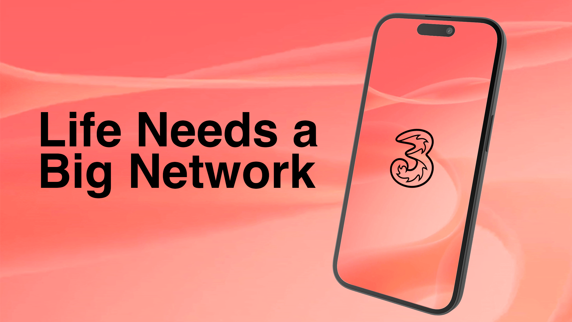
From a conceptual standpoint, I focused on selling the lifestyle, not just the product. Instead of promoting plans through technical specs like “100GB data” or “unlimited minutes,” I designed a more human, aspirational narrative; positioning the app to speak to “streamers,” “music lovers,” and “social media enthusiasts.” This approach shaped the upgrade journeys to feel more personal and motivating, transforming the app from a utility into a brand experience.

> Although this concept was not implemented in the initial prototype, I presented it as a future design direction; one that reframes the app experience around lifestyle identity rather than product specifications.

Visual & Interaction Design

The final prototype emphasised motion and interaction as storytelling tools. Smooth transitions, progressive disclosure, and clear micro-interactions guided users naturally through the experience; demonstrating hierarchy, responsiveness, and brand personality. Every interaction was designed to feel intentional and polished, conveying reliability and innovation.

Interactive animations helped stakeholders feel how the app would function, making abstract concepts tangible and emotionally engaging. This realism was key in securing buy-in, as it bridged the gap between visual design and business vision.

Impact

  • Secured funding with stakeholder buy-in
  • 4.4★ app store rating
  • Ranked No. 32 in Utility charts (Previously No. 27)
  • Modernised workflow

The high-fidelity prototype successfully achieved its core objective; securing stakeholder buy-in for full app development and the adoption of Figma as the primary design tool. The interactive prototype helped stakeholders visualise the app’s potential, building confidence in both the proposed experience and the agency’s delivery capability.

Following its successful implementation, the live app has since achieved a 4.4★ App Store rating; a significant turnaround from its previous low scores, and currently ranks #32 in the Utilities chart (previously #27). These results reflect the project’s lasting impact on customer perception, app usability, and brand trust.

The project not only unlocked funding for the next phase and ongoing work for the agency, but also helped establish a modernised design workflow that continues to shape Three’s digital experience today.

Reflection

This project taught me the value of adaptability and resourcefulness — especially when starting from incomplete information. Early on, I learned to proactively fill gaps by conducting my own audit, which became crucial in shaping the project's direction. I also discovered how deceptively time-consuming it can be to migrate tools and rebuild assets, but the process deepened my understanding of both ecosystems and strengthened my confidence in Figma’s capabilities.

The toughest challenge was presenting progress when there was little to show, while balancing stakeholder expectations with transparency. Looking back, having key data and assets ready earlier would have accelerated delivery, but working within those constraints pushed me to prioritise clarity, communication, and visual storytelling. Overall, the project reinforced how powerful design tools and clear intent, can be in building alignment and trust, even under pressure.