When we talk about online accessibility, we usually mean things like colour contrast, ARIA labels, screen readers, and keyboard navigation. More recently, we’ve also started to talk (rightly) about designing for neurodivergent users.
All of that matters.
But there's another side of accessibility that doesn't get talked about enough: how content is delivered, and the friction and barriers that come with it.
Accessibility isn't just how something looks.
It's also what you need to access it.
The other day, I received an invoice from a service provider. It arrived as a Word document. I happen to have Microsoft Word, so opening it wasn’t a problem for me.
But what about people who don’t?
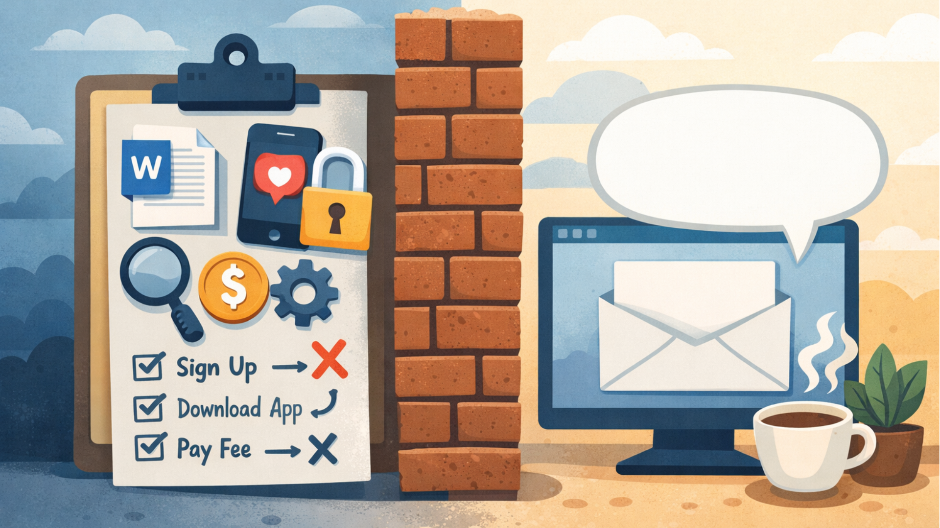
Content shouldn’t force someone into using proprietary tools just to read it. Not everyone has access to the same resources, financially or otherwise, to open a file. Requiring a specific app or licence immediately creates a barrier, or at least unnecessary friction.
A PDF or even a simple HTML invoice would have avoided that entirely.
Friction is still a barrier.
Over Christmas, a service provider encouraged me to take part in an Advent calendar giveaway. Sounds harmless enough, until I realised it was hosted entirely on Instagram.
I do technically have an Instagram account, but I no longer use social media. To take part, I would’ve had to:
- download the app
- log in
- find and follow the company
- interact with them daily
Each step required effort I wasn’t willing to give.
This is the kind of friction that quietly excludes people. Not because they can't use the platform, but because they choose not to, for mental health, focus, privacy, or personal reasons.
A simple multi-channel approach could have solved this. For example, a daily email instead. That's a channel I already use and would have happily engaged with.
Accessiblity includes choice.
When planning content delivery, it’s important to think about touchpoints, not just interfaces.
Users shouldn't be forced to:
- sign up to new services
- download new apps
- create accounts
- or purchase licences
Just to access information that could have been delivered in a more open, neutral way.
Accessibility isn't only about compliance.
It's about respecting people’s time, tools, and circumstances.
If your content requires extra hoops to jump through, you're not just adding friction; you're excluding people.