Project Overview
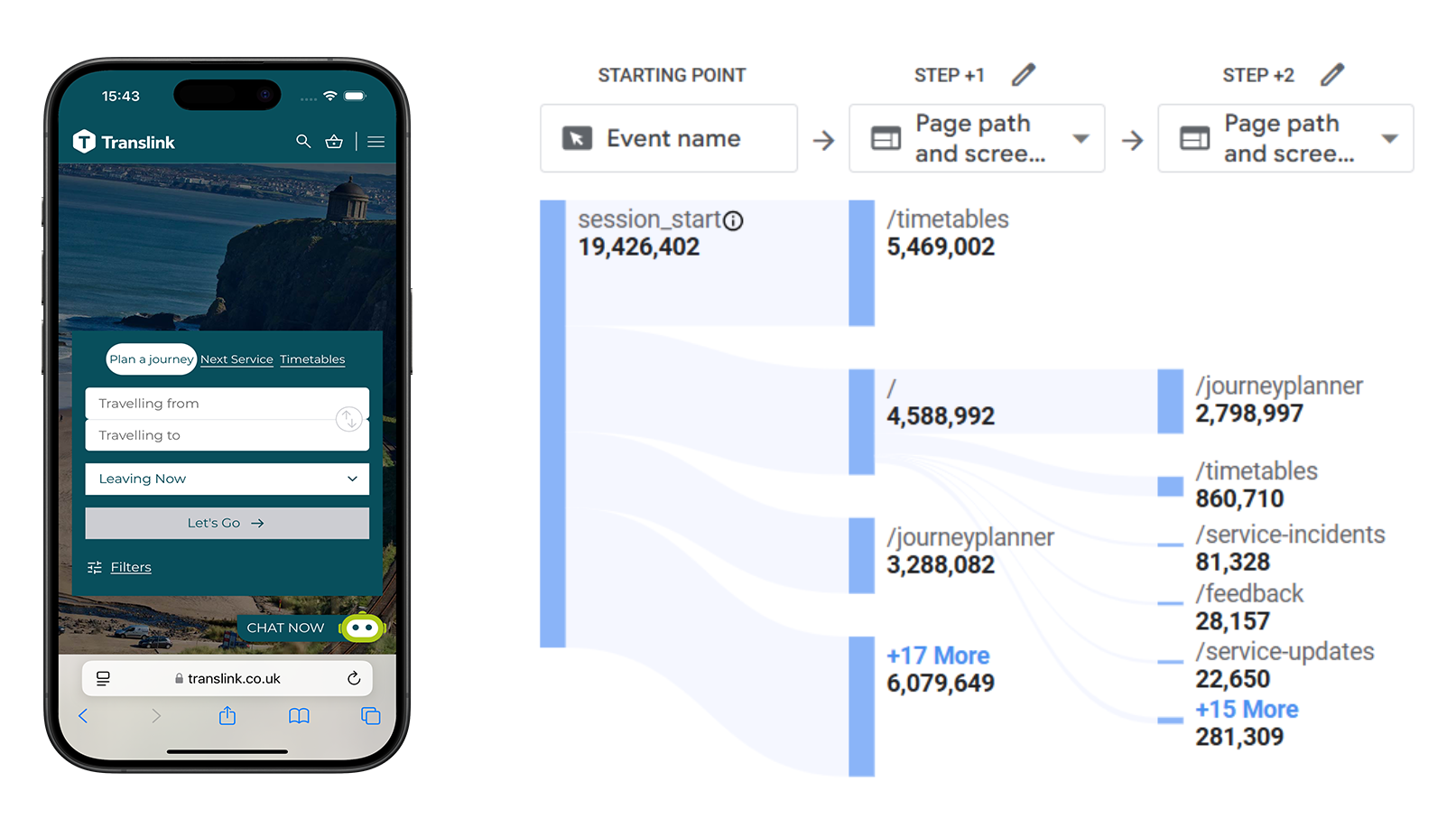
Translink is Northern Ireland’s public transport provider, serving millions of passengers across bus, rail, and metro services. The homepage is the primary entry point for journey planning, ticketing, and service updates — yet despite roughly 80% of traffic coming from mobile devices, conversions lagged behind desktop and users frequently exited from high-intent pages like the Journey Planner and Timetables.
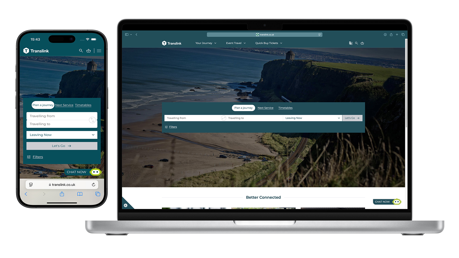
As UX Designer, I led the homepage redesign — turning GA4 analytics and heatmap insights into a mobile-first, WCAG-compliant experience built around reusable, modular components that better support passenger needs and give the Translink team more flexibility. The accessibility bar is explored further in Accessibility: Beyond colour contrast.