← Back to Portfolio

Translink Homepage Redesign

Designing a mobile-first, self-service homepage for Northern Ireland’s public transport users.

  • Mobile-first
  • WCAG 2.2 AA
  • Data-informed
  • Component-based
  • UX Designer
Translink homepage analytics showing mobile traffic and high exit rates on Journey Planner and Timetables

Project Overview

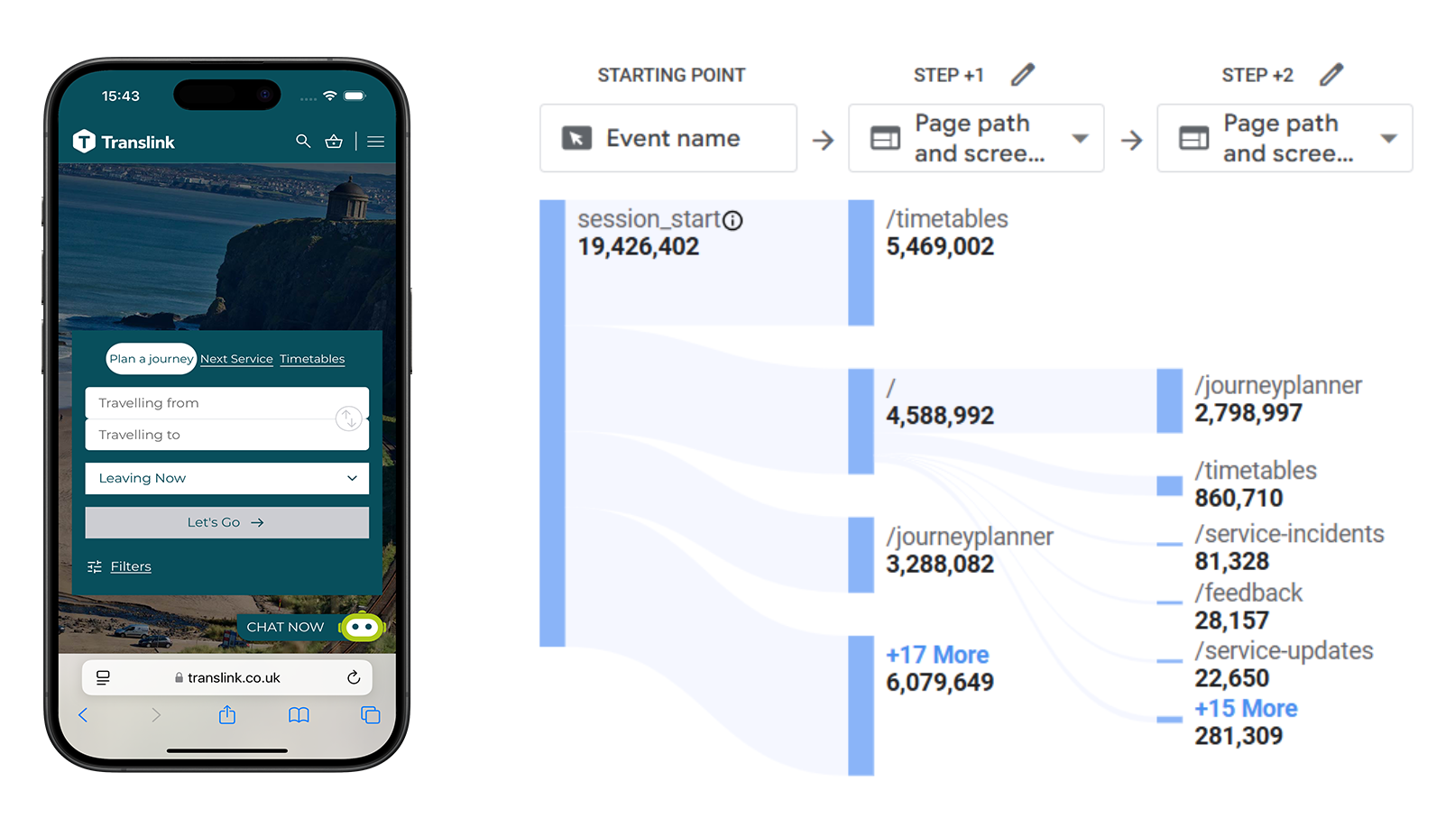
Translink is Northern Ireland’s public transport provider, serving millions of passengers across bus, rail, and metro services. The homepage is the primary entry point for journey planning, ticketing, and service updates — yet despite roughly 80% of traffic coming from mobile devices, conversions lagged behind desktop and users frequently exited from high-intent pages like the Journey Planner and Timetables.

As UX Designer, I led the homepage redesign — turning GA4 analytics and heatmap insights into a mobile-first, WCAG-compliant experience built around reusable, modular components that better support passenger needs and give the Translink team more flexibility.

Project Context Snapshot

Company:

Translink — Northern Ireland’s public transport provider

Duration:

Homepage UX redesign engagement

Tools:

GA4, heatmaps, Figma

Team:

UX Designer (my role), collaborating with Translink’s digital team on homepage IA, modular content components, and accessibility.

Objective:

Redesign the homepage to improve mobile conversions, meet WCAG 2.2 AA, reduce drop-offs on key journeys, and introduce reusable components across templates.

The Challenge

  • Mobile gap: ~80% of sessions on mobile, but lower conversions and higher drop-offs than desktop.
  • Dead ends: Journey Planner & Timetables were top exit points despite high intent.
  • Layout: Oversized hero and inflexible components buried key information.
  • Accessibility: Content not fully optimised for WCAG and small-screen usage.
Analytics heatmap showing user drop-off patterns on the Translink homepage

Research & Insights

Analytics and heatmaps revealed a clear gap between user intent and the existing homepage experience. Navigation bar usage sat below 10% — especially on mobile — while low scroll depth meant content below the fold was routinely missed. Journey Planner and Timetables showed the highest exit rates despite representing the most common user tasks.

Using MoSCoW prioritisation, I mapped homepage content against user needs:

  • Must: Planner, Tickets, Alerts, Campaigns, App promo
  • Should: FAQs, News teaser, “Why choose Translink”
  • Could: Explore NI, Personalised messaging

The research made the design direction clear: elevate ticketing and the journey planner above the fold, surface alerts and live updates prominently, and build flexible components that could scale across the site without sacrificing accessibility.

Design Approach

Guided by the analytics and prioritisation work, I focused on three experience pillars — prominence, modularity, and accessibility — to reshape how passengers interact with the homepage on mobile.

  • Key tasks above the fold: Reduced hero height and prioritised Journey Planner, Tickets, and Alerts in the first viewport.
  • Flexible, reusable components: Designed campaign blocks, alerts banners, news teasers, FAQs, and explore content as modular units usable across templates.
  • Mobile-first & accessible: Optimised type, spacing, and tap targets for small screens; aligned colour, contrast, and focus states to WCAG 2.2 AA.

Visual & Interaction Design

The visual system prioritised clarity over decoration. Each module was designed to work independently and in combination — a passenger arriving for a timetable should reach the planner in one tap, while someone checking service alerts sees live updates without scrolling past an oversized hero.

Component spacing, typography, and interaction states were tuned for thumb reach and small-screen readability. Focus states, contrast ratios, and tap target sizes were validated against WCAG 2.2 AA throughout, ensuring the redesign worked for all passengers — not just desktop power users.

Impact

  • +50% Expected CTR on Journey Planner
  • ≥75 Target Lighthouse Score (Mobile)
  • Reduced bounce from Planner & Timetables
  • Reusable components across templates

The redesign established a component-based foundation that gives Translink’s team more flexibility to update content without rebuilding pages from scratch. By surfacing high-intent tasks above the fold and aligning the experience to mobile usage patterns, the new homepage is positioned to improve conversion on key journeys and reduce the drop-offs that analytics had flagged.

Reflection

My role was to interpret existing data and translate it into actionable design. By focusing on usability, accessibility, modular components, and deliver a homepage that better supports passenger needs and gives the Translink team more flexibility.

Looking ahead, the same approach could extend to Events and Belfast Visitor Pass pages, align patterns with the mobile app experience, and continue iterating on funnel clarity through ongoing analytics monitoring.