Skip to content
Chet Tailor — home
  1. Home
  2. Portfolio
  3. 3 Mobile App

3 Mobile App: Native Redesign

From a 1.3★ web-view wrapper to a native app that restored trust

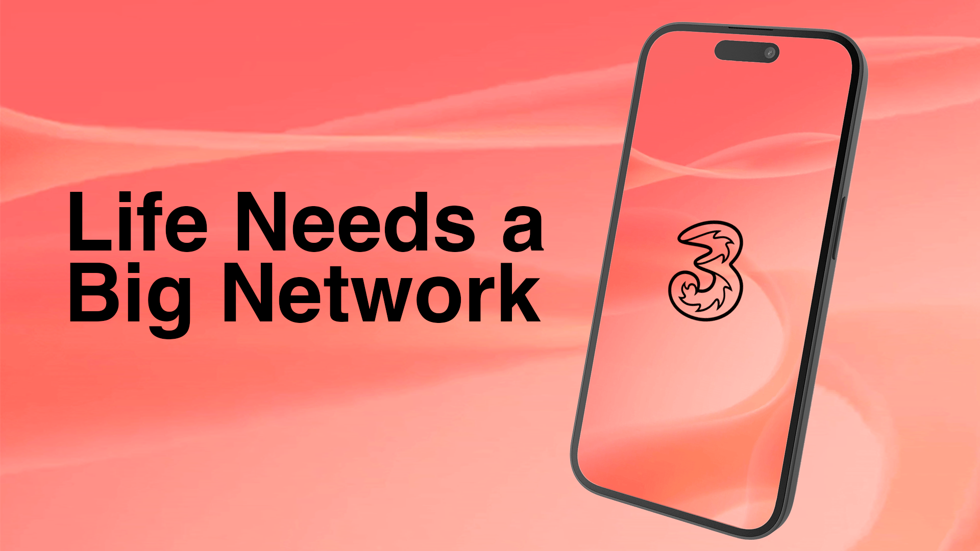
Three mobile app on a smartphone showing the home page
  • Role

    Principal UX/UI Designer

  • Timeline

    4 Weeks

  • Tools

    Figma, Interactive Prototyping

  • Outcomes

    Secured stakeholder funding; App Store rating increased from 1.3★ to 4.4★

The Challenge

After migrating to a new platform, the Three Mobile app became a “web view wrapped in an app.” This resulted in broken interactions, confusing navigation, and a frustrating user experience. Consequently, the App Store rating plummeted from 4.4★ to 1.3★, with over 90% of reviews turning negative. The objective was clear: redesign the core experience as a truly native app to restore usability and user trust.

Research & Insights

To understand the root causes of the negative feedback, I conducted a comprehensive UX audit of the existing application. This revealed:

  • Broken Journeys: Inconsistent “pay now” flows and non-functional CTAs across billing screens.
  • Duplicated Flows: Redundant steps that added unnecessary friction to account management.
  • Poor Hierarchy: A lack of clear visual structure, making it difficult for users to complete basic tasks.

The data made it clear the app needed a full structural and experiential redesign, not just a visual refresh.

Design Approach

The previous app’s core failure was its reliance on non-native web views. My primary objective was to transition the experience into a fluid, component-driven design system. I audited the existing information architecture and streamlined the most critical user journeys, specifically the billing and account management flows, by removing redundant steps and standardising primary actions.

To bridge the gap between abstract concepts and final implementation, I built a high-fidelity prototype in Figma. This allowed stakeholders to experience the app’s motion, progressive disclosure, and micro-interactions firsthand. By demonstrating exactly how the navigation would feel on a physical device, I secured buy-in for the native approach and established a clear, shared vision for the engineering team. See also why UX must speak the language of business — stakeholder buy-in was as much about framing outcomes as it was about the interface.

Impact

  • Secured funding with stakeholder buy-in
  • 1.3★ to 4.4★ App Store rating
  • Ranked No. 32 in the Utilities chart

The high-fidelity prototype successfully secured stakeholder buy-in for full native development. After launch, the live app achieved a 4.4★ App Store rating, a significant turnaround from its previous low scores, and currently ranks #32 in the Utilities chart.

Reflection

This project reinforced the importance of advocating for the user, even under tight deadlines. While it would have been easier to reskin the existing web views, pushing for a native, component-driven approach ultimately saved the app’s reputation and restored user trust.

More case studies

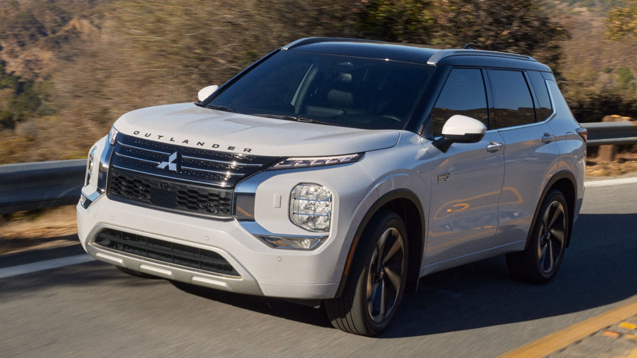
A Mitsubishi car

Mitsubishi Motors UK — Website Redesign

Test drives · configurations · digital showroom

Reimagining a digital showroom that captures clarity, emotion, and the essence of every vehicle.

Read the case study
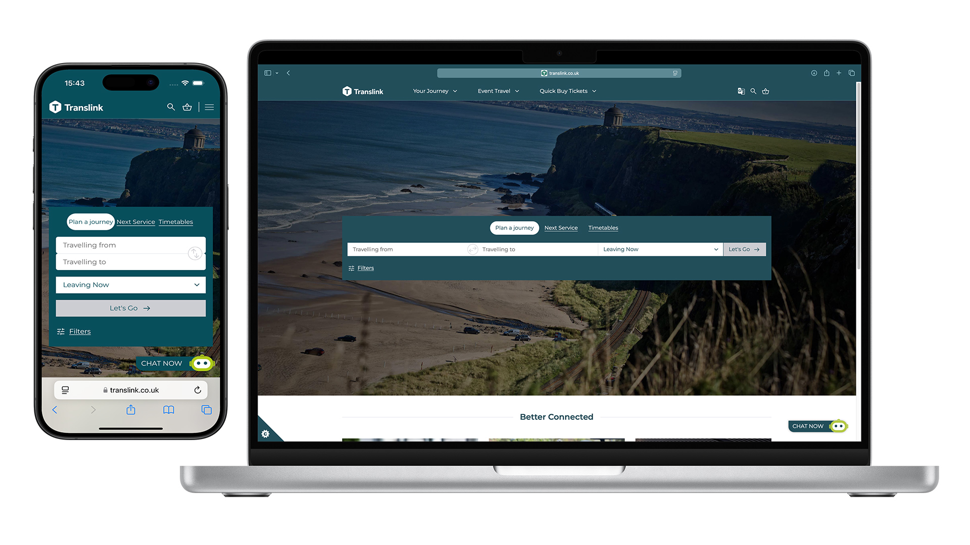
Train and buses, Translink public transport

Translink Homepage

~80% mobile traffic · self-service IA

Redesigning Northern Ireland's public transport homepage.

Read the case study
Contact me My YouTube
Privacy Policy

© 2026 Chet Tailor — Experience Designer

menu
  • Portfolio
  • Perspective
  • About
  • Explorations
  • Resonance App
Menu position